Baseball Adoption History By Country
Final project on Baseball Adoption History.
https://sites.google.com/site/rgodfreyflashstuff/system/app/pages/admin/attachments
https://9602b3bf-a-62cb3a1a-s-sites.googlegroups.com/site/rgodfreyflashstuff/FINAL.swf
Google/Trimble Sketchup
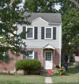
This week I'm working with Google (soon to be Trimble) Sketchup and did my duplex. After it's finished, you can click on "Share Model" and then upload it to the Trimble 3D Warehouse which will then submit it for review in Google Earth. This is a neat way to build up your neighborhood in Google Earth for 3D modeling!
Google Building Maker
For Google Building Maker, I chose the Fort Sam Houston Library in Texas. The A/C units on the top of the building took awhile.
Final Project Plan
For my final project, I am going to do the history of baseball and its global adoption nationwide over time. I plan to design this very similar to historic maps that depict how an empire has geographically spread throughout time. So there will be a timeline incorporated as the map pans and zooms to different scales to tell its story.
For a majority of the project I think the map will be focused on the United States so I will have to incorporate more detail at this larger scale and then will zoom back out as other countries come into play.
Finding data regarding origin is easy to find :
http://en.wikipedia.org/wiki/History_of_baseball_outside_the_United_States , but how to change each boundary and at what rate could be an issue.
I found some data on Little League regions which is probably what my final map should look like so it's a start:
http://commons.wikimedia.org/wiki/File:Little_League_Baseball_Map.png
The end product should look like the Maps of War series:
http://www.mapsofwar.com/ind/imperial-history.html
As each country is triggered on the timeline, the map will simultaneously update if there are multiple countries that overlap adoption times.
My estimated planned time schedule will look like:
1) In a week, complete research.
2) Mid April, finish maps at different zoom levels and add base content.
3) End of April, Present to class for feedback
4) Continue adding new content until it's finished up to the end of the semester.
Operation Barbarossa Final Product
Operation Barbarossa with the finishing touches. Obstacles encountered in this one included having to manually move all frames to the right in order to insert a blank frame to the left. Then you have to drag the extra frame back to the end frame (-1 to the left) and then remove the extra frame that's leftover. Other challenges included getting the autoplay to stop going where I added a stop at my Splash screen and a stop at the end of the Play button frames which did the trick. If I had more time I would add more "Pop Ups" on a mouseover, I thought that was pretty nifty.
Other Professional Effects for Maps
1. A nice invasive species map from the Center for Bioenvironmental Research. The user is able to interact with the map by clicking on the different buttons to move around, in, and out.
http://is.cbr.tulane.edu/PortalsAndPathways.html
2. A video created by Visualize Early Washington that incorporates various 3D map elements.
http://www.youtube.com/watch?v=eKY45I9Bsho&feature=youtu.be
3. An animated 2010 earthquake in Haiti. The animation for the earthquake and the appearance of vibration illustrates the earthquake event so well. The video also zooms into the most pertinent areas to show the details of the volunteered geographic information through Open Street Map as well as refugee tent camps in blue.
http://vimeo.com/9182869
4. An Attack Map of Pearl Harbor that integrates MANY different techniques and effects to create an extremely professional product. From the splash screen to the sound to the ability to pan and zoom, this really is outstanding!
http://www.nationalgeographic.com/pearlharbor/ax/frameset.html
5. This Women's Voting map has a really nice pre-made transition "popup" that comes out of the top of the when you click on a country. It also possesses 3 maps in one where you can change what types of information you are looking at.
http://777voting.com/
6. The side popout when double clicking a state is a nice feature with a ton of info in this Measuring of America Map. Included is demographics, education, socioeconomic and it really integrates the map with the ranking pyramid well.
http://www.measureofamerica.org/maps/
7. Nice video game map that lets the user add notes to any icon on the map for later use. Click on a zone and then an icon. It has smooth hotspot transitions built in.
http://gw2cartographers.com/#/en/
8. Nice Flash map with a very slick hoverover list of available, fresh ingredients when you click the state. It includes the season at the top as well as links within the state's information.
http://www.epicurious.com/articlesguides/seasonalcooking/farmtotable/seasonalingredientmap
Subscribe to:
Posts (Atom)